5 Things You Should Consider Before Choosing the Paint Colour
1. Consider the Architecture/Design of Building
The architectural style and design of your commercial property play a significant role in paint colour selection. The right colour palette should complement the building’s structure, maintain consistency with its overall aesthetic and fit to its surroundings.
- Modern Buildings: Neutral tones (whites, greys, blacks) with bold accents for a sleek look.
- Heritage Buildings: Earthy tones, pastels, or whites to preserve charm.
- Industrial Spaces: Greys, blacks, or vibrant accents to enhance raw materials.
- Retail & Hospitality: Colours should match the brand and create an inviting space.
2. Consider the Purpose of the Building
Your colour choice sets the tone for your business and influences how customers and employees feel in the space.
- Corporate Offices: Neutral tones (greys, whites, soft blues) create a professional, focused environment.
- Retail Spaces: Bold colours (red, yellow, orange) attract attention and encourage engagement.
- Healthcare Facilities: Calming shades (light blue, green, pastels) promote relaxation and trust.
- Hospitality & Entertainment: Warm tones (deep reds, browns, golds) create a welcoming, indulgent feel.
- Educational Institutions: Energising and calming colours (blues, yellows) support focus and creativity.
If your business already has a well-established colour scheme, consider incorporating it into your property’s interior or exterior. Using brand colours strategically—whether on feature walls, signage, or accent details—helps reinforce brand identity while ensuring the space remains visually appealing and functional.
A well-planned commercial paint job enhances customer experience and strengthens your brand presence.
3. Consider the Natural Light and Space Size
The way a colour looks on a sample card may be completely different from how it appears in your commercial space. Light exposure, room size, and surface finishes all affect how colours are perceived. Understanding these factors ensures your chosen paint colours achieve the desired effect.
Lighting can dramatically change the way colours appear throughout the day:
- Natural Light: Spaces with ample sunlight make colours appear more vibrant and true to their shade. Lighter colours can help maximise brightness, while darker tones may appear even deeper in well-lit rooms.
- Artificial Light: Warm lighting enhances reds, yellows, and oranges, while cool lighting makes blues and greens appear crisper. LED lighting can sometimes create a stark effect, making colours look cooler than intended.
- North vs. South-Facing Rooms: North-facing rooms receive cooler, indirect light, which can make colours look more muted. South-facing rooms get warmer, direct light, enhancing warm tones.
Using colour to alter perception of space:
- Smaller Spaces: Light colours such as whites, soft greys, and pastels make a room feel larger and more open.
- Large Spaces: Darker tones can add warmth and make expansive areas feel more inviting.
- Ceiling Height: A lighter ceiling colour can create a sense of height, while a darker ceiling can make a space feel more intimate.
Before committing to a colour, test samples in different lighting conditions to see how they shift throughout the day.
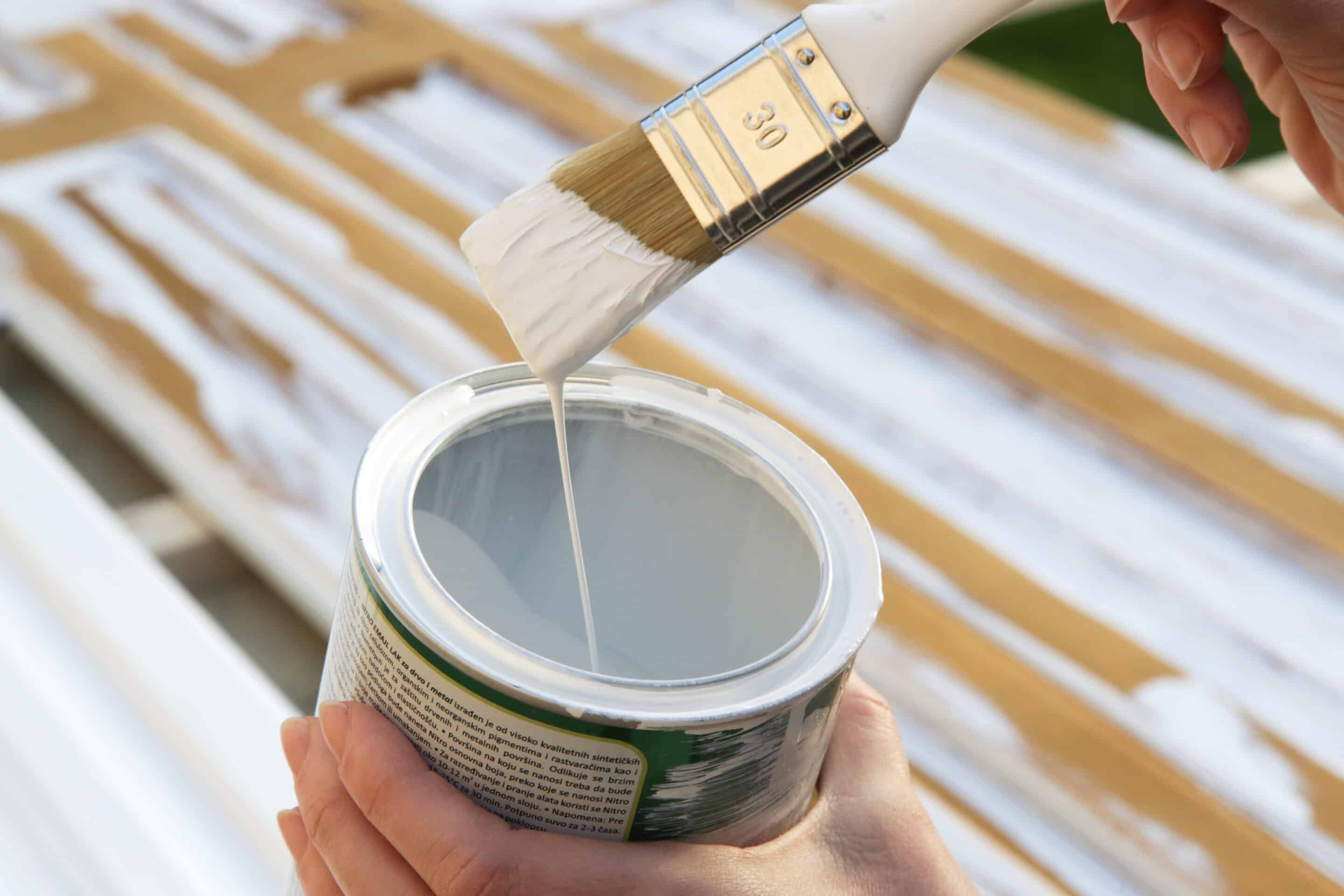
4. Consider Durability and Maintenance
Commercial properties experience high foot traffic, making it essential to choose paints that are durable, easy to maintain, and resistant to wear and tear. The right finish and quality of paint can extend the life of your walls while keeping the space looking professional and inviting.
Choosing the Right Paint Finish
Different finishes offer varying levels of durability and maintenance:
- Matte (Flat) Finish:
- Provides a smooth, non-reflective appearance.
- Hides imperfections well but is harder to clean.
- Best for low-traffic areas like executive offices or conference rooms.
- Eggshell & Satin Finish:
- Offers a slight sheen and is easier to clean than matte.
- Ideal for reception areas, hallways, and general office spaces.
- Semi-Gloss & Gloss Finish:
- Highly durable, stain-resistant, and easy to wipe clean.
- Perfect for high-traffic areas like lobbies, kitchens, and washrooms.
Paint Types for Long-Lasting Results
- Washable Paints: Essential for areas prone to scuffs, dirt, or stains.
- Mould-Resistant Paints: Recommended for spaces exposed to humidity, such as kitchens, bathrooms, and basements.
- Low-VOC (Volatile Organic Compounds) Paints: These reduce indoor air pollution and are ideal for workplaces prioritising sustainability and air quality.
Choosing a high-quality, durable paint ensures a long-lasting finish that reduces maintenance costs.
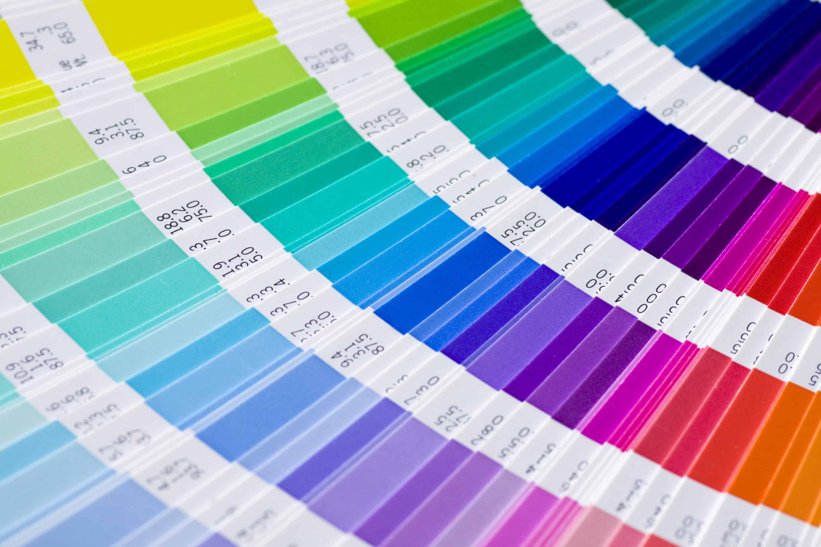
5. Consider the Impressions You Want to Make
Each colour evokes different emotions, making it important to select shades that align with your business objectives.
- Blue: Associated with trust, professionalism, and calmness, making it ideal for offices, banks, and corporate environments.
- Green: Symbolises health, balance, and sustainability. It’s commonly used in medical practices, wellness centres, and businesses with an eco-conscious focus.
- Red: A high-energy colour that stimulates appetite and urgency. It’s commonly seen in restaurants, gyms, and retail stores aiming to create excitement.
- Yellow: Represents warmth, optimism, and creativity. It works well in learning environments, design studios, and retail spaces where a positive and uplifting mood is desired.
- Grey & White: Neutral tones that create a modern and sophisticated aesthetic. These shades are often used in professional office spaces and minimalist design concepts.
- Black: Evokes luxury, exclusivity, and sophistication. High-end boutiques, luxury hotels, and premium brands often use black to create a sleek, high-class atmosphere.
Based on our experience with commercial paintings, there are four main factors that you can think of when choosing the commercial paint colour for commercial property.
Why Choose Trend Painting Solutions?
Trend Painting Solutions offers expert commercial painting services for your commercial property. Our team provides professional colour consultation, high-quality workmanship, and premium, durable paints designed for high-traffic areas. We work efficiently to minimise disruptions, ensuring projects are completed on time and to the highest standard.
Safety and compliance are our priorities, and we tailor solutions for offices, retail spaces, and industrial facilities. Whether refreshing your space or rebranding, we deliver a flawless, long-lasting finish. Contact Trend Painting Solutions today for expert advice and a professional touch that enhances your commercial property’s appearance and durability.